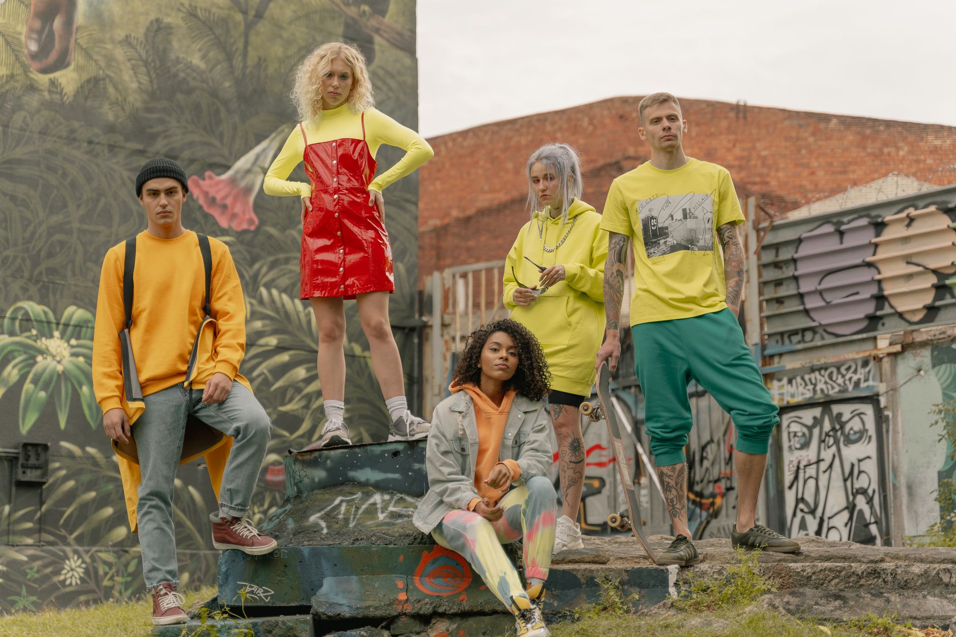
How Color Theory Applies to Streetwear Design
Color theory is the foundation of visual communication. It's a set of principles that dictate how colors interact with each other and our perception of them. While color theory is often associated with fine art, it plays an equally important role in streetwear design. In this post, we'll explore how color theory applies to streetwear design and why understanding these principles can elevate your designs from good to great.
Color theory has been a fundamental part of art for centuries. It dates back to the ancient Greeks who believed that colors were associated with specific moods or emotions. These ideas were later developed by artists like Isaac Newton, who discovered the visible spectrum of light and its corresponding colors, and Michel Eugene Chevreul, who conducted research on color perception and contrast.
In streetwear design, color theory is used to create visual interest and convey specific messages. Designers use color psychology to understand how different colors can evoke certain emotions or responses in their audience. For example, bright colors like red or yellow are often associated with energy, excitement, and attention-grabbing appeal, while cooler colors like blue or green are linked to calmness, trustworthiness, and stability.
Color contrast is another key aspect of color theory that streetwear designers use to create visual impact. By pairing complementary colors – those opposite each other on the color wheel – designers can achieve high contrast looks that draw the eye. This technique can be seen in many popular streetwear brands like Supreme, who frequently use bold red text against black backgrounds for their iconic box logo designs.
Color harmony is another principle of color theory that streetwear designers should consider when creating their designs. Harmony refers to how colors work together to create a balanced and pleasing composition. There are several types of color harmonies, including monochromatic (using shades of one color), analogous (using adjacent colors on the wheel), and complementary (using opposite colors). Each type of harmony has its own unique aesthetic and can be used to convey different moods or messages in a design.
Understanding color theory is not just about creating visually appealing designs; it's also about understanding how colors interact with each other in different contexts. For example, certain colors may look great together on a computer screen but appear washed out when printed on fabric. Or, a color that looks vibrant under fluorescent lighting might appear dull under natural sunlight. By understanding these nuances, streetwear designers can create designs that translate well across various mediums and environments.
In conclusion, while color theory may seem like an esoteric subject, its principles are essential for any streetwear designer looking to elevate their designs. By understanding how colors interact with each other and our perception of them, you can create visually striking designs that convey specific messages and emotions. So next time you're designing a new piece, take a moment to consider the role of color theory in your work – you might be surprised by the results!